Friday, September 28, 2012

Vintage Sign Restoration Project

Last week I discovered a lovely shabby chic home interior store in Provo, Utah called Brambles. I have no idea how I've  never made it in before but I'm glad my mother-in-law encouraged encouraged me to drop in. (Thanks Chyrl.)
While I was in there I noticed a great vintage real estate sign that Lisa, the owner of the shop recently picked up. She asked to me to restore it and I had a great time doing it.

The sign had been used a few times over. The last person in possession of the sign blacked out the letters with black ink.

Here is the before and after.


The bottom photo shows a close up of the drippy black ink that covered the letters before I restored it.

The top photo shows how it looked when I finished it.

What do you think?


If you are a local to Provo head over to Brambles, you'll be happy you did.
 I am working on some other 
fun projects that will be for sale there very soon. 


Thursday, July 5, 2012

Family Meal Plan Printable

Eating together as a family makes us smarter and happier.

"Sitting down to a meal together draws a line around us," says Miriam Weinstein, author of The Surprising Power of Family Meals. "It encloses us and, for a brief time, strengthens the bonds that connect us with other members of our self-defined clan, shutting out the rest of the world."

• 19% of teens who have fewer than three family dinners per week report that there is a great deal of tension or stress between family members, compared to 7% of teens who have at least five family dinners per week.

• More mealtime at home was the single strongest factor in better achievement scores and fewer behavioral problems in children all ages. More meals at home also resulted in less obesity.

For more facts about the great things that happen when we make time to eat together check out,

I know this is important so I decided to make a Weekly Family Meal Plan Chart printable. I am going to try this format for a week and see how it goes.


Let me know what you think. You can right click on the image above and save it, then print!

Tuesday, May 29, 2012

Back Stage

Outdoor concerts are the best. 

That's what summer is all about. I headed over to Stanford's Laurence Frost Amphitheater to see a few bands last week. I was really excited to see my bro-in-laws band, Eyes Lips Eyes open for Modest Mouse. The show kicked off with Benjamin Francis Leftwhich and then Eyes Lips Eyes took the stage. I actually got to go back stage while Modest Mouse played, which was rad. 


I guess the description in my above photo should say back stage with Tony Hello from Eyes Lips Eyes, while Modest Mouse is playing, but it didn't look as good.


Here is a dancing tree getting the crowd excited in the back ground. 
The tree is Stanfords unofficial mascot which is a member of the Stanford Band. 


Modest Mouse crate.

Anyway it was super fun and I will make the above design available for download soon.


Thursday, May 24, 2012

New Logo for Pearls with Purpose

Here is a new logo I just designed for a great non-profit organization.


The Mission of Pearls With Purpose Foundation is to improve the living conditions in third world countries while helping women accessorize  with genuine handmade jewelry at amazingly affordable prices.

You can find out more about them here.

Monday, April 2, 2012

Letterpress Invite

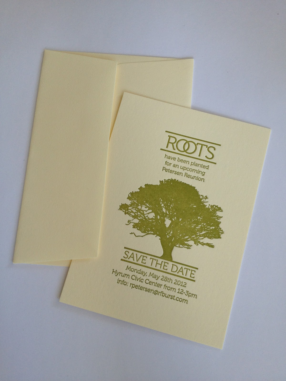
Here is a family reunion save the date invite that I designed.


To follow will be the official invite.


I used Rowley Press in Provo, UT to print these.
A few high-quality letterpress print shops like this are popping up with the rise in demand for this process in upscale invitations and stationary.
The type and art work are actually pressed in the paper and it requires a high degree of craftsmanship. In the expert hands of someone like Leeland Rowley letterpress gives the piece a classic feel and finish.

Click here for more info about how letterpress works.

Monday, March 19, 2012

Mint to Be

Here is a layout I did with a new kit I designed called Mint to Be. It has geometric shapes in mint, and light peach, with wood shapes for contrast. Enjoy the sneak peak. Let me know what ya think.


 I am currently working on a billion (okay maybe a little less than a billion) digital scrapbook kits, to populate my first online store. It's been a long time coming, but it's going to happen.


Saturday, March 17, 2012

A slew of Green


Happy Saint Patricks Day!

Did, you know originally, the color associated with Saint Patrick was blue? Over the years green and its association with Saint Patrick's day grew. Green is better since shamrocks were worn as well. Saint Patrick is said to have used a 3 leaf shamrock to explain the Holy Trinity to the pagan Irish. 

In the spirit of the day I thought I'd share a few of my favorite green things. Enjoy.

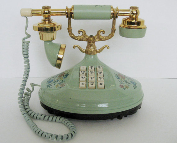
Vintage Empress Phone


Old Cafeteria Plate


Pretty Earrings

Pretty Essie Polish
Dragon Fly Scarf

and my silly cat Pixel.